A Stupendous Idea - My New Custom Showit Website
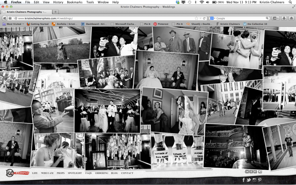
Way back in the day of film, you didn't need a website if you wanted to be a photographer, you needed a printed portfolio. I had one of those. Enter digital, I jumped on board and eventually got myself a website, but at that time most people paid THOUSANDS of dollars to have a designer custom make one, and I didn't have money. I never thought that I would ever be able to afford that luxury. Starting then, and for almost 10 years, I have used a small website company for my site. I found them in the back of Photo District News Magazine, and their idea was cutting edge at the time. Template based, drag and drop your images, you create your own site for a monthly fee. For a long time this site worked for me, until one day it totally didn't. The templates were clean and simple, and while I do believe that less is more, my work was anything but that as time moved on and I started shooting weddings. My visual style was changing and I needed a site to show that. I wanted a website that really let the client feel that THEY wanted to be just like my clients in the photos they were looking at. I wanted to bring an energy to my work and have that explode out of the computer. I wanted music. I wanted....something different. I didn't want my site to look like anyone else.
One of the hardest things about being an artist is letting yourself be inspired by other artists without actually copying what they do. There are dozens of photographers out there who's work I LOVE! I think I want to shoot like them, but I physically can't and shouldn't, because I am not them. Their clients aren't my clients. But I can be inspired by them. Trying to stay true to who I am and not following trends, even if I like them, is the biggest challenge for me. I am a rule breaker by nature (but I stay out of trouble, I swear!), and I wanted my site to break some rules. I wasn't doing this to appease other photographers. I was doing this for my clients and for me. But I had no idea where to start. My wedding business was growing. My work was changing. I knew what I wanted but the hard part was finding someone that could help me bring that vision to fruition.
One night I was obsessing about my new site that didn't exist and just couldn't sleep. There were so many companies that allowed me to design my own, but I just didn't have the time, or the knowledge. I knew I needed to make a serious investment because well, I wanted people to take me and my work seriously. I had been thinking about signing up with a website company called Showit. Their formula was simple, similar to the system I was currently using - drag and drop, use their templates or customize your own. So many options were there for me, but I had no clue where to start. So at 5am one morning, I sat up in bed, grabbed my phone and googled, "Custom Showit Website Designers". I mean, there had to be someone out there that was doing that for Showit. Right? And there she was, page two of my google search. Tara Peterson, founder and mastermind behind Stupendous Designs. Actually, it wasn't her website that I found, but a blog post written by Boston photographer, Deborah Zoe. Deborah had blogged about her experience working with Tara. After reading that post and finding out that Tara was local, I got excited. Although I was a tad concerned because even love I love Deborah's work and her site is fantastic, it wasn't the style I was looking for. Our work was so vastly different. Would Tara even understand what I was looking for? I decided to look at Tara's business site. When I hit enter and her site loaded up, I almost jumped out of bed. Holy crap! Our taste was identical. I had found my designer! It was a miracle of miracles. I didn't even look at anyone else. I knew she was my girl!
I reached out and contacted her, we talked on the phone and I insisted that we meet up for dinner. I told her she needed to meet me face to face in order to produce what I really needed. We hung out for about two hours and I bounced off a zillion ideas. She got what I wanted right away. She was thrilled that I really knew who my client was and could describe them to a T. We set up a pinterest board so she could see what floated my boat. I reiterated that I didn't want it to look like anyone else's website. She loved that. And then....then I told her about my answering machine idea.
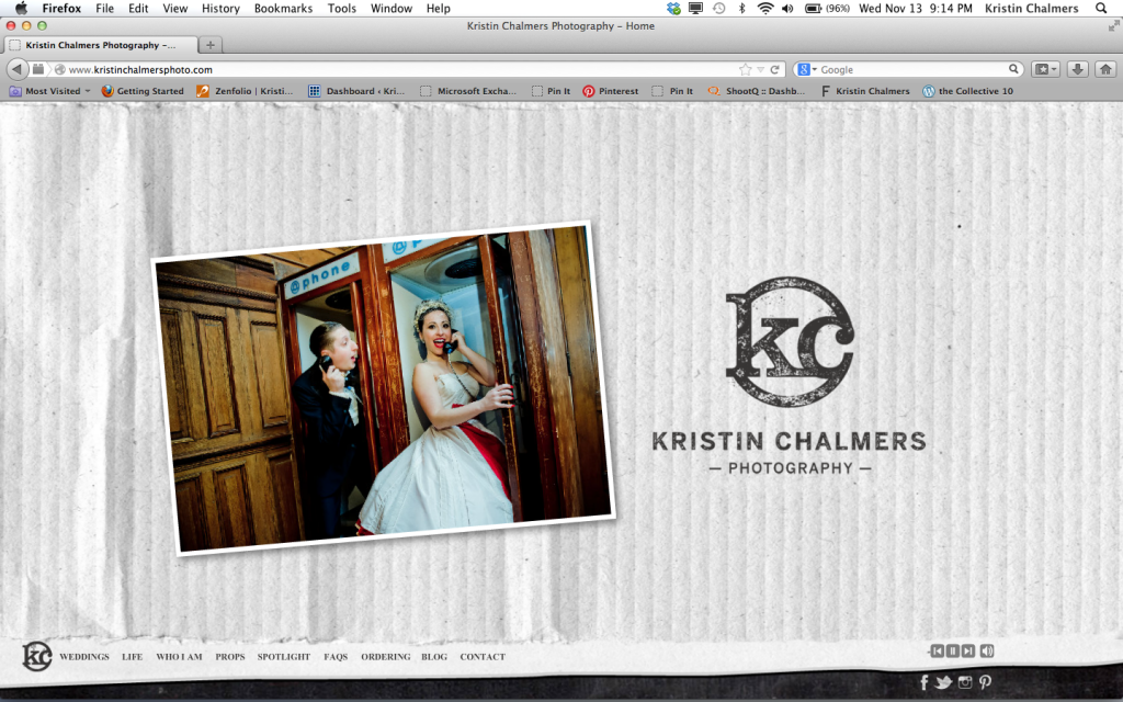
I really wanted to open my site with some video, but I just couldn't swing it, time wise or money wise. (I will not even begin to tell you about it because I may just do it in the future), I told her I wanted my audience to feel like they were eavesdropping of my voice mails with my clients. But I wanted it to have the feeling of old answering machine voice mails. With the beep and all. She LOVED THAT IDEA, but could it be done? Hmmmm.
We figured out that if I set up a google voice account, I could forward those digital voice mails directly to Tara and she could add some effects that gave it a vintage sound. I sent an email to my clients asking them to call in. Some people left actual messages and some left messages that were more like testimonials. Because I wasn't able to direct them, and honestly I didn't want to because I wanted the messages to come from my client's hearts, not mine, it was hard to make it work at first. I almost gave up, but Tara wouldn't let me. She encouraged me to keep at it until we had just a few of the right ones. Boy am I glad she didn't let me bail on that.
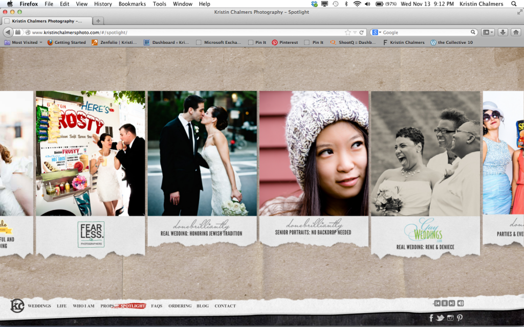
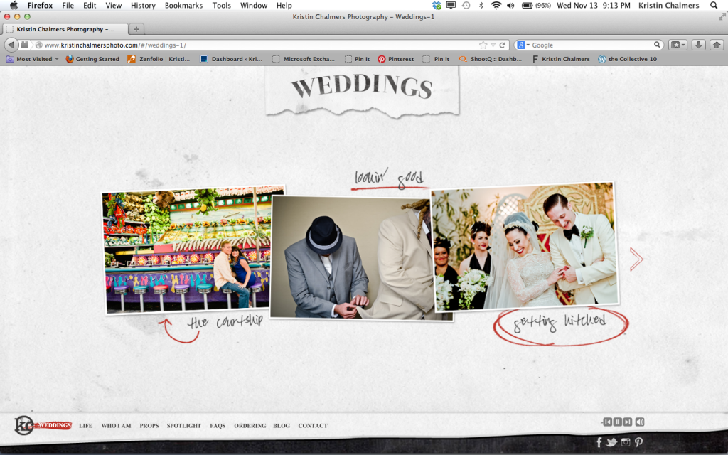
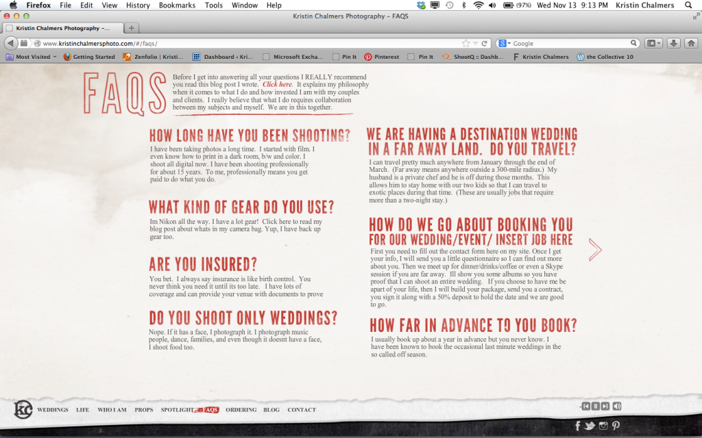
In addition to the voice mails, there is music on the site and many people have an opinion about this. I love music. It's part of my brand. I feel that a person's taste in music says sooo much about who they are. That being said, I know that lots of folks check out my site at work and need the site to be silent. There is a warning when the site loads to tell the viewer there will be audio. There are also controls for the viewer to turn it off at any time. These buttons are on the lower right and I think we may need to put some text above it so you can find it right away. Tara added some new pages as well, like the spotlight page as well as a FAQ page, which I love.
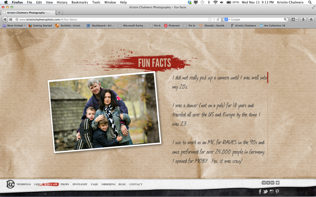
Investing in Tara was the best thing I ever did. I love Showit too. The best feedback I got from peers was "Holy crap, this site SCREAMS you and your brand". That's exactly what I wanted to hear. I think Tara understood me from the minute we spoke on the phone. If you need a custom site, I can't say enough about her. She delivered the site on time and has been working on the small kinks that come with job. I just love her. You can find Tara through her website Stupendous Design. Tell her I sent you. She was worth every penny! I got over 2000 hits the first day I launched!
Oh and if you ever become a client and want to leave a voice mail for my site, contact me directly and I'll give you the number to call. I'm planning on changing them from time to time without notice. I guess it's like an audio Yelp. hmmm...now there's an idea.
